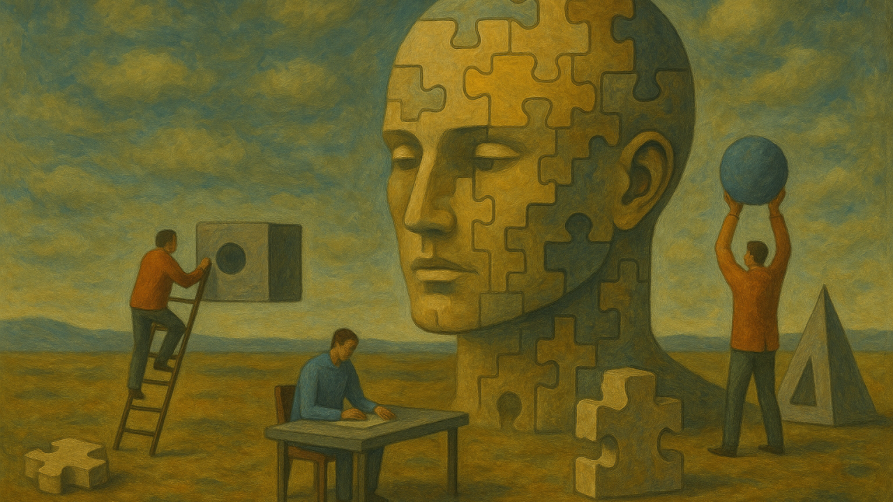
“Design is in everything, and if you can see a design system (or pattern) in everything, it is the difference between memorizing how to put something together, and understanding multiple ways to build something when the environment or materials are dynamic.”
I have a constant interest in smart devices, learning how they work exactly, and how I can use them to improve my life. When I think about it, I have always had some sort of piecemeal system I hobbled together with questionable open or beta software and parts that were not-quite made to do exactly what I needed them to do, with hardware not meant to be compatible with other hardware, spending countless hours to find solutions so that became more about overcoming a challenge than the original goal of automating certain tasks or monitoring various environmental factors, all before smart homes and IoT were a thing (because had they been a thing already, I would have just done that).
When I designed and built my chicken coop/ garden shed this year, the first construction project I had undertaken, I designed it as a testing grounds for a small solar system to gain understanding in order to be better equipped to design the system for my home. There hasn’t been been a challenge I will back down from, and finding new and better ways to execute my ideas is what motivates me. In the case of my luxury chicken condo, I built it in a modular way in order to better handle heavy work alone, and to build it in my basement where I had a warm, safe, controlled environment, enabling me to spend my time efficiently. Having an eye for design and engineering helped me to observe building practices utilized in other builds of the same type and size, and gain an understanding for requirements for factors I had never previously considered, like a specific roof slope to handle heavy snow loads in North East winters, or having windows and doors on the south side for passive solar.
Why am I talking about building a chicken coop when I should be marketing myself as a UX designer? Design is in everything, and if you can see a design system (or pattern) in everything, you already have an understanding of how to design and you have a guide to develop a process for executing on that design. My process isn’t perfect and I admit, room for trail and error is important (it is called “testing!”), but to me it is the difference between memorizing how to put together a thing, and understanding multiple ways to build a thing when the environment or materials are dynamic. It is why I am comfortable designing for a responsive web interface, a mobile app, a smart watch app, streaming app, AR, or VR, designing for the actual needs of a user over the idea of having a “seamless” experience, but instead having the right experience (the appropriate experience, the expected experience, the don’t-waste-energy-thinking-about-it experience) they were looking for. This is also why I am not afraid of machine learning, but rather excited for the future of AI in design.
I am right-left-brain balanced, I am analytical and creative, I can visualize the pathway to a solution using tried and tested methods, and I can invent new methods. I am exceedingly visual, I can identify patterns and problem solve in ways many can’t that enable me to pick up and learn tools extremely easy in order to research the most relevant information, intuit accurate hypothesis, test the relevant theories, and visualize clearly the possible solutions and present those solutions to stakeholders and explain the solutions in ways that not merely satisfies a project goal, but creates deeper understanding and collaboration. I don’t want a team that agrees with me, I want a team that understands the goal and will work together to create the best experience for our users with work we can be proud of, that expands our knowledge in the field collectively and individually.
Generative AI like chatbots and virtual assistants are not just tools, they are experiences. But how do you design one that is not only functional, but also delightful? How do you create an experience that users trust can understand, respond, and adapt to the user’s needs, preferences, and emotions? How do you design a virtual assistant experience that can encourage natural, personalized, and creative conversations?
For the magazine Maine Cannabis Chronicle, I worked with Weedhouse to art direct, design, layout, and copyedit the Her Highness quarterly column that appears in the magazine.
6 “Ghost Kitchen” brands under one, the first of its kind in Maine. Work includes 7 logos total, menu, style sheets, and a website that delivers to users a cohesive ordering experience. Ghost: Karen's Kitchens
Slab Sicilian Streetfood is another Jay Loring (of Nosh) restaurant opened with Stephen Lanzalotta (of Micucci sicilian slab fame) and rated one of the most anticipated openings of Spring 2014 in the country. I designed the logo, starting menu and full menu, as well as entrance window and door signage, bakery window and labels for all their takeout packaging. I also made their logo into a large (and small) stamp to apply their logo anywhere and give their takeout packaging an authentic effortless look.
The menu presented a challenge because like a lot of places with amazing beer offerings, Emily Kingsbury, the beer goddess of Slab, wanted the ability to change the menu daily AND have those offerings on the menu. I set her up with a word doc template designed and styled after the style of the menu, so that she will be able to print the drinks on the back of the menu.
I should mention that this place will be amazing and if you don't make it your goal in life to have the luna bread you are a bad person.
Press:
Alex Steed interviews in Shift Drinks: Jason Loring of Nosh and Slab.
Eater Maine: Menu Porn:Yes, Slab Opened Yesterday; See Menu Here
Portland Press Herald: Fired Portland pizza maestro slices new plan
Eater Maine: Behind The Scenes Photos of Slab
slabportland.com features a panel long-scroll layout, easily updated featured content areas, a dynamic menu, rotating gallery to show off the goods, and a customized google API. Tied in with their active social media presence.
Photo by John A Ferreira
Print advertising for Maine Spirits. The first one is a monthly ad series to appear on the back cover of Dispatch magazine which will feature a different cocktail offering from a new bartender each month. The second print ad is a two-page spread that will appear in Downeast magazine each month. It will feature cocktails from the beloved Portland favorite, bartender John Myers.
Nosh, located on the corner of Oak Street and Congress Street, recently had their menus redesigned as well as a complete website redesign. For the menus: They have three separate pieces, the food menu, the drinks menu and the specials menu. To differentiate the menus when folded together I chose to use varied folding and bright color bars to create a tabbed look. The food menu is a tri-fold, the drinks menu gets placed inside with the specials menu, both of which have different widths to help create that tabbed look. The specials menu is the only one that changes, so I had to create a solution that would allow a new menu to be printed easily every day but still conform to the style created by the permanent menus. For the specials menu I created a stationary of which to use a pre-designed template for. Only the color bar and cropping were done in bulk leaving a blank area for the ever-changing menu to be printed on daily. I created a template in Word format that would be easy for the manager of Nosh to use, keeping the formatting and printing in exactly the right area.
noshkitchenbar.com features easily-updated featured content areas and menu, customized google API, a dynamic menu with consistent branding to printed assets, and some sweet graphic horizontal seperaters.
Front and back, menu. 18" x 10.5" laid-flat
Before cutting. Notice the "funky" letters. In order to be sure that no gaps would show due to the precision of my closely-cropped letters, I had to manually create "bleed" in any area of the letters that were to hit the edge.
Nosh menu, folded with drinks and specials menus tucked in.
I made these posters with tears and pixels. I cry every time. I am particularly proud of the Time & Temp sadness. Logo design, graphic design, photography and photo-manipulation done by me, but like, whatever.
¯\_(ツ)_/¯
Simple full-page print ads to run in the September and October issues of Dispatch magazine.
Photography by Peter Bissel.
An app, made for you (if you are a child learning shapes and colors!). Designed the graphics, logo, user flow, user experience. The best part about this, is that you can record your own voice, your kids voice, any voice, and save profiles, so that your child can learn using the voices she recognizes!
Concept and development done by Justin Colangelo, extensive testing done by Ava Colangelo and family.
Currently in the works: SoPo Bar & Grill in South Portland, a new venture from Outliers Eatery owner Peter Verrill.
Read about it at Eater
I was asked to design the CIFF (Camden International Film Festival) schedule in a way that clearly and creatively organized the film times and days.
Custom logo design and print design for a wonderful bar/restaurant in Portland, Maine. The ad was published in several publications in the area. The place is great, the atmosphere is great, the bartenders are great and for goodness sake, get yourself the LFK burger.
Mohawk superfine Luxe by Moo paper. 3.25" x 2.125", black and cyan. These very fat 32pt thick cards have a bright cyan core. Yeah!